

Professional lubricant packaging design has become one of the most important competitive tools for industrial oil brands operating in modern global markets.
In the lubricant industry, packaging has evolved far beyond its original functional role. Today, it acts as a strategic communication tool that influences perception, trust, and market positioning. Whether displayed on retail shelves, in industrial supply catalogs, or across digital marketplaces, packaging frequently becomes the first indicator of product quality.
This is especially important in highly competitive lubricant markets where many products offer similar technical performance. In these situations, visual presentation becomes a major differentiator. A well-designed lubricant package communicates professionalism, engineering precision, reliability, and brand confidence. On the other hand, weak packaging immediately creates doubt, even if the product itself performs exceptionally well.
Modern industrial buyers are more visually sensitive than many brands realize. Distributors, wholesalers, workshop owners, and end consumers subconsciously judge products based on:
For premium lubricant brands, packaging is no longer optional branding decoration. It has become part of the product experience itself.
Unlike lifestyle industries where emotional branding dominates, lubricant packaging operates in a unique space between technical communication and visual trust-building.
A motor oil package must communicate:
all within seconds.
This challenge becomes even more complex when products are displayed among dozens of competing brands using similar visual language: metallic colors, dark backgrounds, aggressive typography, and technical imagery.
As a result, successful lubricant packaging is rarely about “making something look attractive.” Instead, it is about creating strategic differentiation while maintaining industrial credibility.
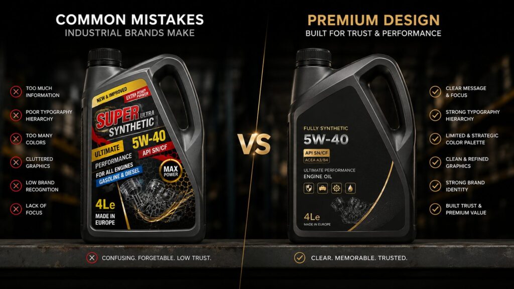
One common mistake many industrial brands make is overloading their packaging with information. In an attempt to appear more technical, labels become crowded with icons, specifications, gradients, and inconsistent typography. Ironically, this often reduces trust instead of increasing it.
Professional packaging systems prioritize clarity before complexity.
A strong lubricant package usually achieves three things immediately:
For example, premium synthetic oil products often use:
while economy products tend to rely on louder graphics and crowded visual systems.
This difference is rarely accidental.
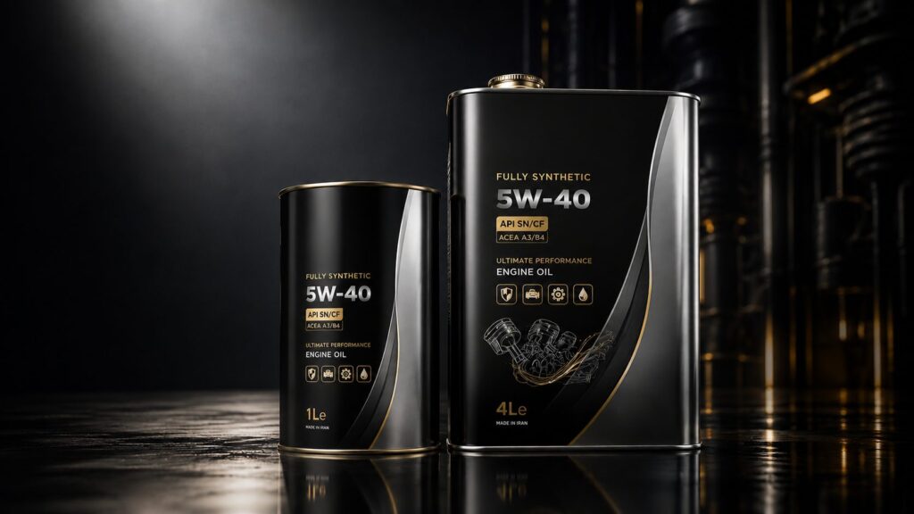
Global markets have significantly changed packaging expectations in recent years.
Industrial buyers now compare products internationally. A lubricant container produced in one country may compete visually against brands from Germany, Japan, the UAE, or North America.
Because of this, local visual standards are no longer enough.
Packaging must now meet international expectations for:
This shift has made premium packaging one of the strongest competitive tools available to industrial brands.
Even in B2B environments, perception influences decision-making more than many companies admit.
A distributor may never openly say:
“This packaging looks low quality.”
But visual perception silently affects confidence.
And confidence affects purchasing behavior.
In the lubricant industry, premium packaging is not simply about looking expensive. It is about communicating confidence before a customer ever touches the product.
Industrial buyers are surprisingly sensitive to visual quality. Even when purchasing highly technical products, perception still plays a major role in how brands are evaluated. Clean structure, disciplined typography, balanced color usage, and production precision all influence how a lubricant product is perceived in the market.
This is why some products immediately feel “professional” while others appear outdated or unreliable, even when their technical specifications may be similar.
Premium packaging is built through a combination of strategic decisions rather than decorative effects.
The most successful lubricant packaging systems usually share several characteristics:
Interestingly, premium packaging often contains fewer visual elements, not more.
Many industrial brands make the mistake of trying to communicate everything at once. Labels become overloaded with gradients, effects, icons, claims, and technical data competing for attention. Instead of appearing advanced, the packaging begins to feel visually chaotic.
Professional packaging design reduces visual noise and guides the eye strategically.
In industrial markets, clarity creates confidence.
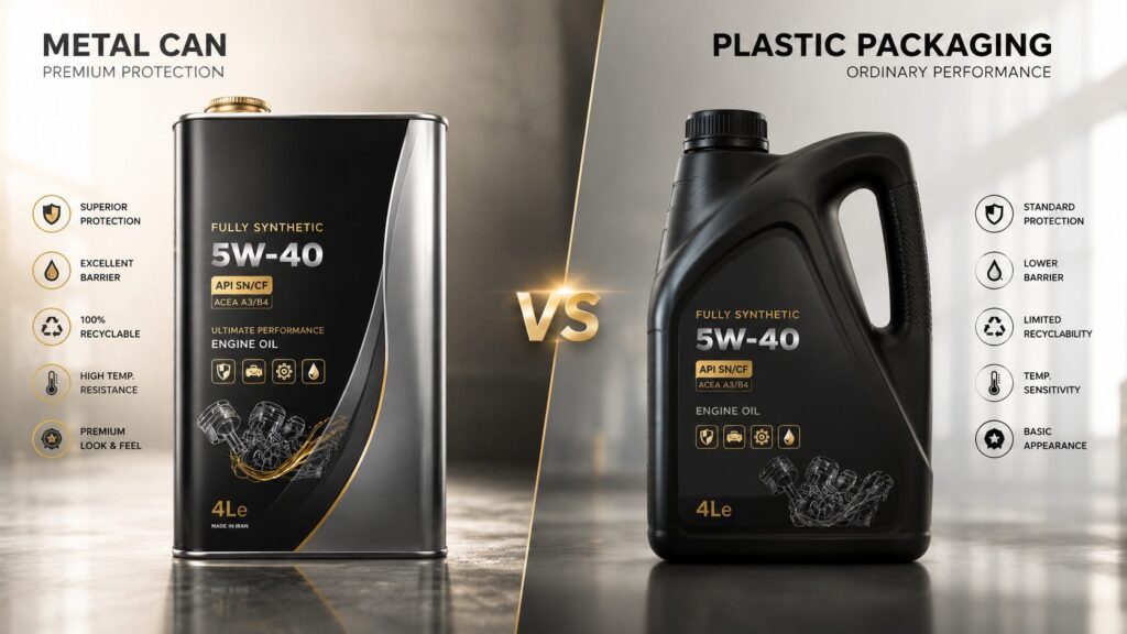
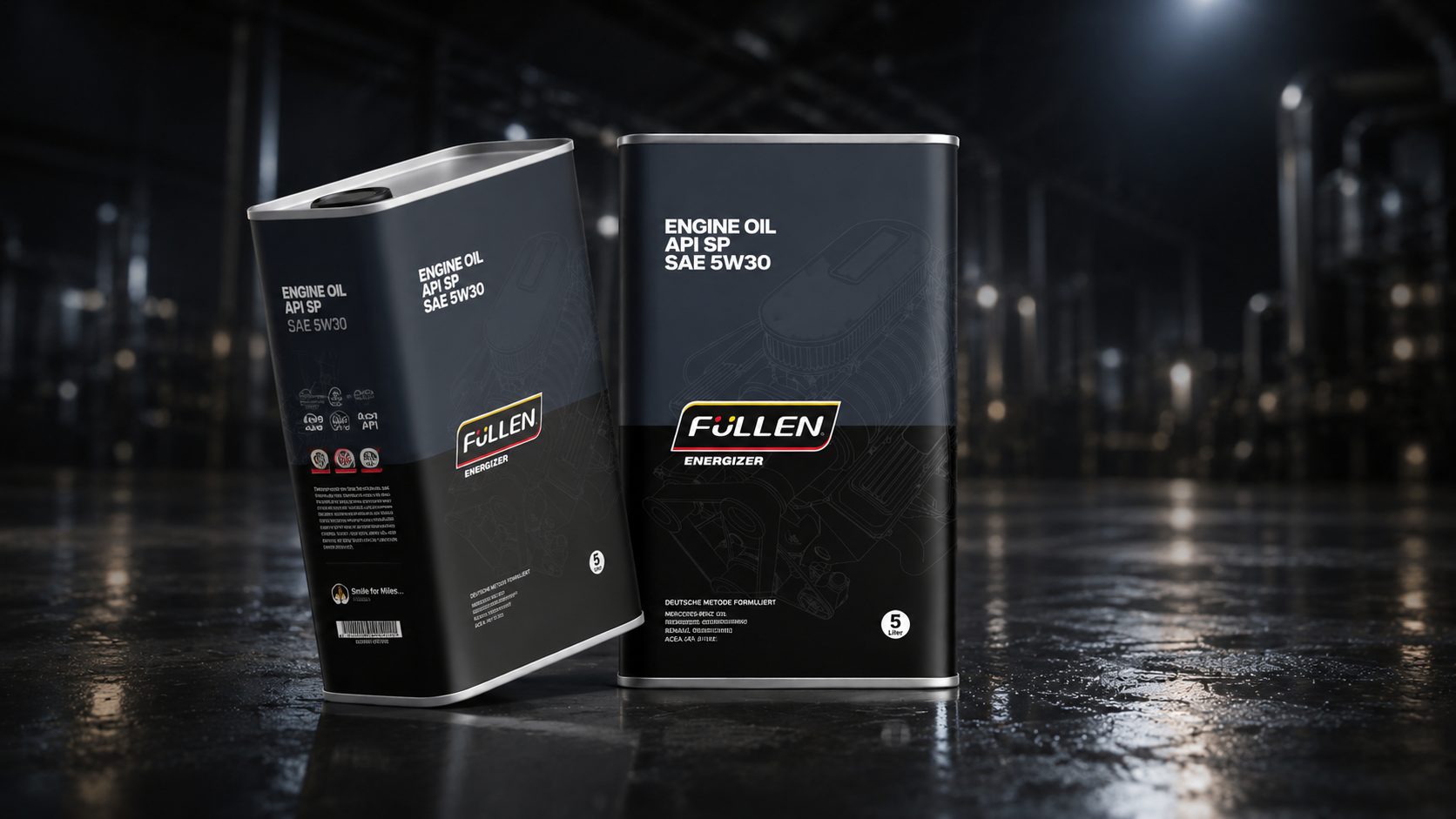
One of the most important decisions in lubricant packaging is the choice between metal and plastic containers.
Both materials have practical advantages, but they communicate very different brand perceptions.
Metal packaging is often associated with:
This is one reason many high-end lubricant brands continue using metal cans despite higher production complexity.
Metal surfaces also interact with light differently. Metallic reflections naturally create a stronger shelf presence, especially under retail or warehouse lighting conditions.
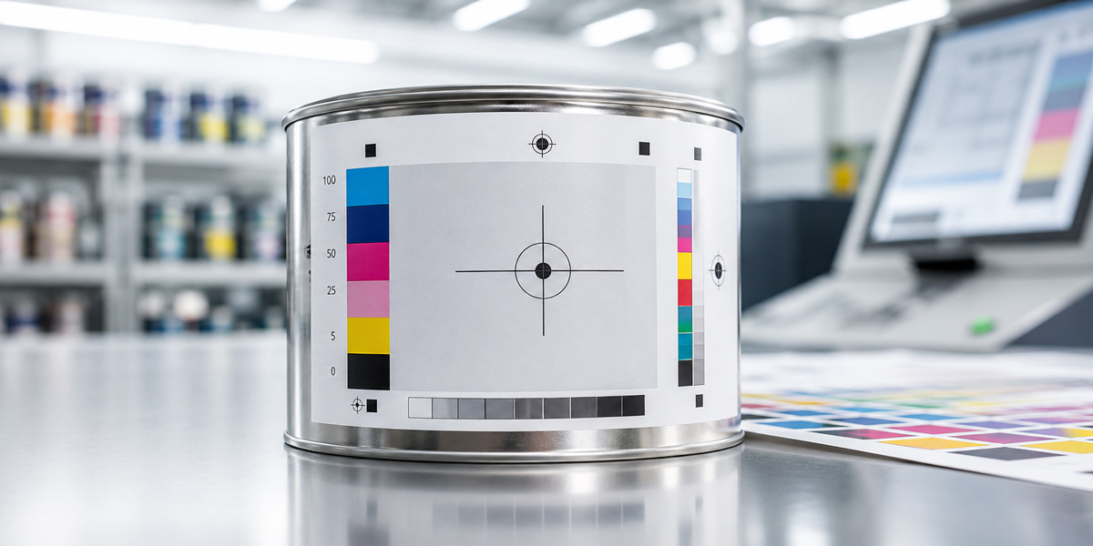
However, metal packaging introduces several production challenges.
Printing on metal requires:
Without professional print-ready artwork, even strong designs can fail during production.
Plastic packaging, on the other hand, offers:
For mass-market products, plastic remains highly practical. But visually, it often struggles to achieve the same premium perception as well-produced metal packaging.
This does not mean plastic packaging cannot look premium. It simply requires more careful branding, lighting, photography, and structural design to achieve comparable market perception.
Ultimately, the best material depends on:
The packaging material itself becomes part of the brand language.
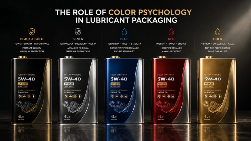
Color is one of the fastest ways consumers interpret industrial products.
In lubricant packaging, color systems are rarely random. Most successful brands use color strategically to communicate performance level, technology positioning, or product hierarchy.
For example:
These associations may seem subtle, but they strongly affect perception in competitive environments.
One important detail many brands overlook is consistency.
When color systems change dramatically between products, customers lose visual recognition. Strong lubricant brands build structured color hierarchies across their product lines so customers can quickly identify viscosity grades, product categories, and performance levels.
This becomes especially important in retail shelves and digital marketplaces where buying decisions happen quickly.
Good packaging design helps products feel organized before customers even read technical specifications.
And in industrial branding, organization often signals professionalism.
One of the biggest misconceptions in packaging design is assuming that a visually attractive concept automatically guarantees a successful final product.
In reality, many lubricant packaging projects fail during production rather than during the design phase.
A package may look impressive on a monitor but lose quality once it reaches the printing stage. Colors shift unexpectedly, metallic surfaces behave differently under lighting, typography loses sharpness, or structural alignment issues appear during mass production.
This is why professional lubricant packaging design requires more than visual creativity. It requires production awareness.
In industrial packaging, design and production must work together from the beginning.
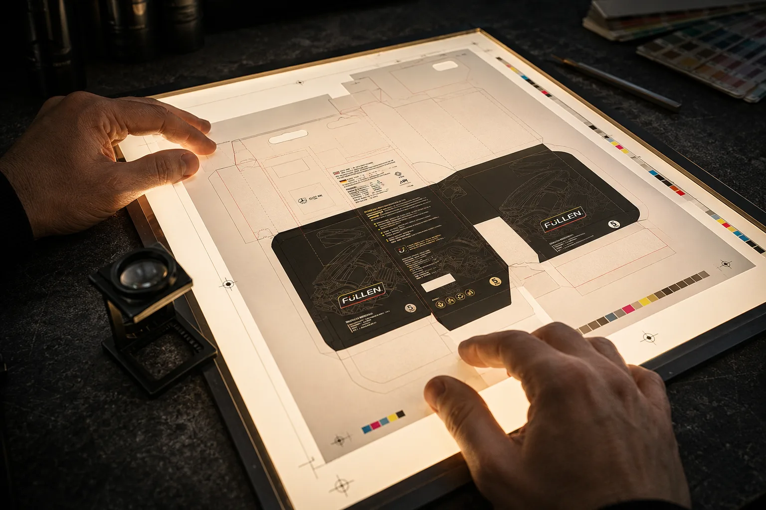
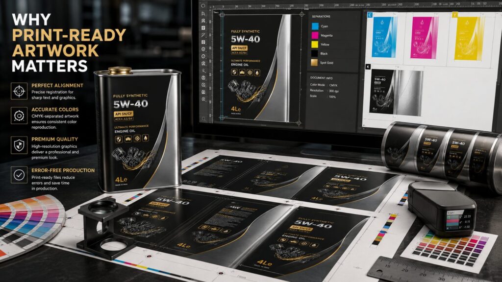
Print-ready artwork is one of the most overlooked parts of industrial packaging development.
Many companies focus heavily on branding and visual appearance but underestimate the technical preparation required for accurate production output.
This becomes especially critical when working with:
Unlike digital screens, physical printing introduces limitations and variables that directly affect final quality.
For example, rich black surfaces printed on metal behave differently than black shown on a monitor. Small registration shifts between printing plates can create visible color fringing around typography. Metallic reflections can also reduce readability if contrast is not carefully controlled.
Professional artwork preparation helps prevent these issues before production begins.
A properly prepared lubricant packaging file usually includes:
These details may appear minor individually, but together they strongly influence production quality.
And in premium industrial markets, production quality directly affects brand perception.
Many lubricant brands unintentionally damage their own market positioning through inconsistent or outdated packaging systems.
One of the most common problems is visual overcrowding.
In an attempt to communicate technical superiority, some labels include:
The result often feels confusing rather than professional.
Strong industrial packaging does not compete for attention internally. It guides attention strategically.
Another common issue is weak product hierarchy.
Customers should immediately understand:
If these elements are visually unclear, the product becomes harder to trust and harder to remember.
Typography is another major weakness in many lubricant packaging systems.
Poor font selection, inconsistent spacing, or overly compressed layouts reduce readability and negatively affect perceived quality. Industrial packaging requires disciplined typography, especially because technical information plays such an important role.
Consistency across product lines is equally important.
When packaging systems lack visual structure, brands lose recognition over time. Successful lubricant companies often build modular packaging systems that allow multiple products to feel connected while still remaining distinguishable.
This creates stronger shelf impact and long-term brand familiarity.
Trust is one of the most valuable assets in industrial markets.
Unlike impulse-driven consumer categories, lubricant products are closely associated with:
As a result, visual presentation carries more psychological weight than many brands realize.
Industrial buyers naturally associate packaging quality with operational seriousness.
Clean structure, consistent branding, and production precision signal professionalism. Weak packaging often suggests inconsistency, regardless of the actual product formula.
This becomes especially important in export markets.
Distributors and international buyers frequently evaluate unfamiliar brands visually before developing deeper technical confidence. Packaging becomes part of the negotiation process itself.
Well-executed packaging helps industrial brands appear:
In many cases, packaging design silently shapes whether a product feels trustworthy enough to enter serious market conversations.
And in competitive industrial sectors, perception often opens the door before technical specifications do.
Successful lubricant packaging is rarely the result of isolated graphic decisions. Strong industrial packaging systems are usually built through collaboration between branding strategy, production knowledge, market positioning, and technical execution.
This becomes especially visible in real-world packaging projects.
Many industrial brands approach packaging redesign because they face challenges such as:
In many cases, the issue is not the product itself. The issue is how the product communicates visually.
A well-structured packaging redesign can completely transform how a lubricant brand is perceived without changing the core formulation.
For example, improving:
can dramatically increase perceived quality and distributor confidence.
This is particularly important for industrial brands entering international markets where visual standards are significantly higher.
In global environments, packaging must compete not only technically but psychologically.
Professional packaging systems help industrial companies appear:
These qualities strongly influence both customer perception and business negotiations.
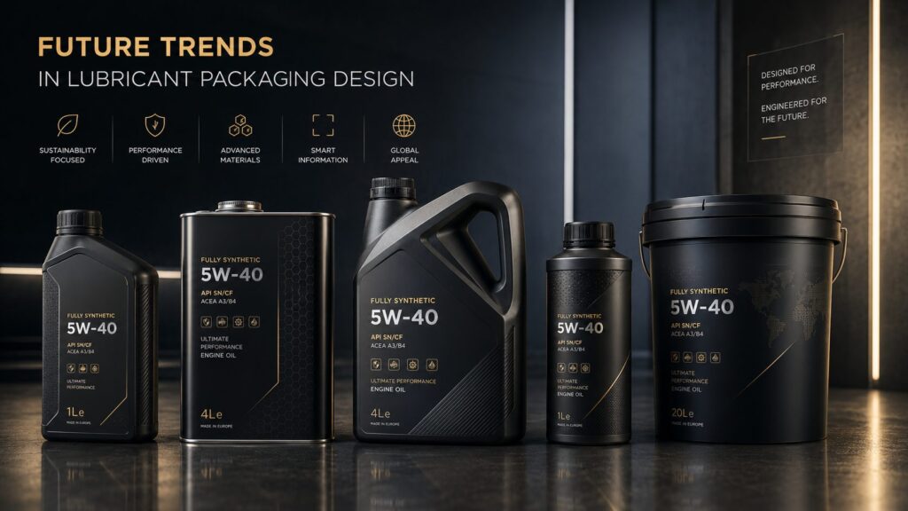
The lubricant industry has traditionally relied on aggressive and heavily technical visual styles. However, recent global trends are moving toward more refined and structured packaging systems.
Many premium industrial brands are now adopting:
This shift reflects a broader movement toward confidence-driven branding rather than attention-driven branding.
Instead of overwhelming customers visually, modern packaging systems focus on clarity and precision.
Sustainability is also becoming more influential.
Industrial buyers increasingly evaluate:
While lubricant packaging still requires strong structural durability, many brands are exploring more sustainable production approaches without sacrificing premium presentation.
Another growing trend is digital-first packaging presentation.
Products are no longer viewed only on shelves. They are also evaluated through:
This means packaging must perform effectively both physically and digitally.
A package that looks strong in person but weak online is no longer enough.
As digital product presentation becomes increasingly important, industrial brands must think beyond the container itself and consider the entire visual ecosystem surrounding the product.
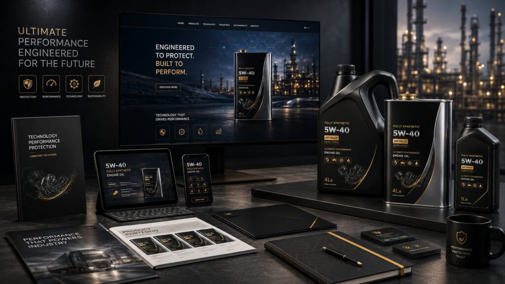
In today’s industrial markets, packaging is no longer just protective structure. It has become a strategic business asset.
Professional lubricant packaging influences:
The most successful industrial brands understand that packaging is part of communication, not just production.
When branding strategy, visual systems, production expertise, and technical execution work together, packaging becomes far more than decoration. It becomes a tool that supports long-term market growth.
For lubricant companies operating in competitive environments, investing in professional packaging design is no longer optional. It is part of building a credible and scalable industrial brand.
Lubricant packaging design is the process of creating visual and structural packaging systems for motor oil and industrial lubricant products. It combines branding, production preparation, technical communication, and product presentation.
Packaging strongly influences customer trust and product perception. In competitive industrial markets, professional packaging helps products appear more reliable, premium, and internationally competitive.
The most common materials are metal cans and plastic containers. Each offers different advantages in durability, cost, production complexity, and brand perception.
Metal packaging usually creates stronger premium perception due to its durability, reflective surfaces, and higher-quality presentation under retail and industrial lighting conditions.
Print-ready artwork refers to technically prepared production files optimized for industrial printing processes, including correct color settings, bleed areas, trapping, typography control, and production alignment.
Professional packaging signals consistency, quality, and operational seriousness. Weak packaging often reduces customer confidence even before technical product evaluation begins.
Common mistakes include overcrowded labels, inconsistent branding, poor typography, weak hierarchy, low-quality print preparation, and excessive visual effects.
Color plays a major role in product perception. Black often suggests premium quality, silver implies technology, blue communicates trust, and gold signals high performance.
Yes. International distributors and buyers frequently evaluate packaging quality as part of overall brand credibility and market readiness.
Consistent packaging systems improve brand recognition, simplify product identification, and create stronger shelf presence across multiple product categories.
Let's discuss your goals and explore the best path forward.