


Preparing print-ready artwork for metal cans is one of the most technical and often misunderstood challenges in industrial packaging production. Unlike paper or plastic substrates, tinplate printing demands precise CMYK color management, correctly structured packaging files, and a thorough understanding of oil can design constraints — from dieline setup to spot color specification. Brand managers working with metal can printing for the first time frequently discover that standard print-ready artwork guidelines do not apply to tinplate lithography. The result is costly reprints, missed production deadlines, and brand identity inconsistencies that follow a product into the market. At Jahanifar Studio, we have spent more than two decades navigating these exact challenges for industrial packaging clients. This article covers what your printer assumes you already know, and what no preflight checklist will catch if your packaging artwork was built on the wrong assumptions from the start.
There is a moment every industrial brand manager dreads. The production run is complete, the cans are stacked on pallets, and something is wrong. The red is slightly orange. The text along the shoulder of the can has shifted two millimeters. The gold that looked sharp on screen has printed flat and dull. The printer shrugs and points to the approved file. Technically, nothing went wrong on their end. This situation is more common than the industry admits. And in almost every case, it traces back to the same root cause: the artwork was print-ready for paper, not for metal.
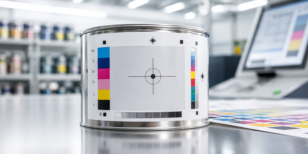
Printing on tinplate is fundamentally different from printing on paper, cardboard, or even rigid plastic. The surface does not absorb ink the way paper does. Instead, printers apply ink in extremely thin layers onto a coated steel sheet, then cure it under high heat. This process, called offset lithography on tinplate, demands a different set of file standards, color expectations, and structural tolerances than anything a packaging designer trained on consumer goods will encounter in day-to-day work.
The metal surface itself contributes to the final visual. On uncoated tinplate, the silver sheen of the steel reads through lighter colors, shifting their appearance significantly. On white-coated tinplate, the base is more predictable, but ink laydown still behaves differently from paper. Understanding which substrate your can uses is not a design preference. It is a technical requirement that shapes every color decision in your artwork file. Most printers will confirm receipt of your file, run a preflight check for obvious errors, and proceed. What they rarely do is call you to explain that your file was built on assumptions that do not apply to their process. That conversation costs them time. The reprinting costs you money.
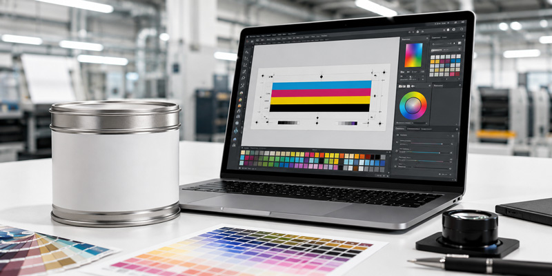
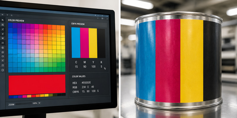
The single most common issue in metal can artwork is receiving a file built in RGB color mode. This happens because designers use the same software setup across all projects. A packaging file that looks correct on a calibrated monitor, rich, saturated, accurate, can shift dramatically when converted to CMYK at the prepress stage. The printer’s RIP software will convert it. However, that conversion is automated and unreviewed. Nobody checks whether your brand red survived the translation.
For metal can printing,you must deliver files in CMYK from the start. Not converted at the last step. Built in CMYK. This distinction matters because color decisions made in RGB, particularly in shadows, deep blues, and saturated oranges, often fall outside the printable gamut for tinplate offset. When those colors are converted, the printer’s software makes its best guess. That guess is rarely what the brand intended.
Beyond color mode, the file format itself carries risk. Many printers accept PDF as a universal handoff format, which it is, in theory. In practice, a PDF exported from a consumer design tool without the correct PDF/X preset will carry embedded RGB images, unflattened transparency, and screen-resolution assets hidden beneath a vector shell. It will pass a basic preflight. It will fail on press.
At normal viewing distance, a metal can label looks sharp if it was printed at 300 DPI or above. This is the standard most designers know. However, for fine-line industrial text, specification details, warning language, barcodes, volume indicators, 300 DPI is often not enough. Regulatory text on lubricant packaging, for example, routinely requires 600 DPI or higher to remain legible after the ink spreads slightly during the curing process.
The spread is small. On paper, it would be invisible. On metal, where ink sits on the surface rather than absorbing into it, even a fraction of a millimeter of dot gain can make 6-point text unreadable. This is not a quality control failure. It is a physics problem that must be solved at the artwork stage, not after printing.
Color management is where most industrial packaging projects lose money quietly. The loss does not show up as an obvious failure. It shows up as a brand red that looks slightly different on the new batch of cans, or a gold accent that reads premium in the artwork file but prints flat and unconvincing on the shelf. These are not printing errors in the traditional sense. They are the predictable result of skipping a step that metal can printing requires and paper printing often forgives.
Every screen displays color using light. It combines red, green, and blue channels to produce the full visible spectrum, including colors that ink on metal cannot physically reproduce. When a designer builds artwork on a calibrated monitor and approves it visually, they are approving a version of the design that exists only in light. The printed version will always be a translation, not a copy.
This translation gap is wider on metal than on any other substrate. Coated paper closes the gap through its absorbency and its white base. Tinplate does not. Ink on metal sits on top of the surface, which means the final color is determined by the ink film thickness, the curing temperature, the white base coating, and the steel beneath it. None of these variables appear in a screen preview.
The practical consequence is this: colors that look identical on screen can print differently depending on which of these variables shifts between production runs. Without a physical color standard, there is no shared reference point between your design team and the printer. Every approval is an assumption.
Specifying a Pantone color is the most reliable way to communicate color intent across production environments. Most industrial brand managers understand this in principle. In practice, the application of Pantone on tinplate introduces complications that are worth understanding before the artwork stage.
Not every Pantone color is achievable on every tinplate printing line. The ink formulations used in metal can printing are not identical to the Pantone Matching System inks used for paper. Some facilities mix their own inks to approximate Pantone references. Others use licensed Pantone ink systems. The difference in result can be significant, particularly for metallic colors, fluorescents, and deep saturated tones.
Before finalizing your color specification, confirm with your printer which Pantone colors they can match on their specific tinplate line. Ask for a drawdown, which is a physical ink sample applied to the same substrate your cans will use. A drawdown costs almost nothing and eliminates the most common source of color disputes after production.
Two technical concepts that rarely come up in consumer packaging design become critical on metal: overprinting and trapping.
Overprinting refers to the decision to print one ink layer directly on top of another rather than knocking out the background. On paper, overprinting decisions are often made automatically by prepress software. On tinplate, where ink layers cure in sequence and each layer interacts differently with the substrate, unintended overprinting can create color shifts that are impossible to predict from a screen proof.
Trapping refers to the deliberate overlap built into adjacent color areas to prevent white gaps from appearing when the printing plates shift slightly during a run. On a high-speed tinplate printing line, registration tolerances are tighter than on a sheet-fed paper press, but they are not perfect. A misregistration of half a millimeter between a black text layer and a white background will produce a visible halo on a metal can, because there is nowhere for the gap to hide. Proper trapping values, set correctly in the artwork file before handoff, eliminate this risk entirely. Neither overprinting nor trapping is difficult to implement. Both require someone to make a deliberate decision during artwork preparation. If your designer has not worked on tinplate before, these decisions will not be made. And the printer will not flag them unless you ask.
A flat artwork file and a three-dimensional metal can are two very different objects. The process of turning one into the other involves mechanical forming, seaming, and in some cases necking or flanging that physically distorts the printed surface. Most packaging designers understand this in theory. Far fewer account for it correctly in the artwork file.
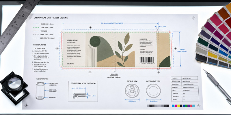
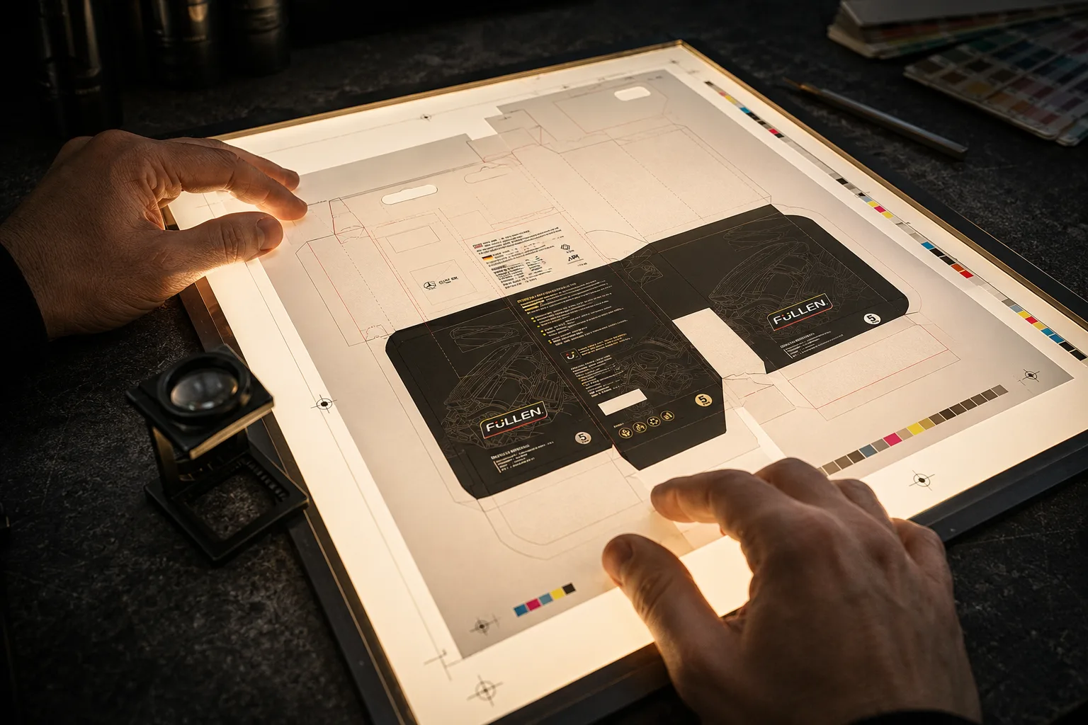
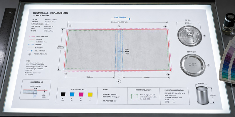
A dieline is the flat, unfolded template that shows exactly where your artwork will sit once the can is formed. It includes the printable area, the bleed zone, the safe zone for critical content, and the areas that will be lost to mechanical forming. For cylindrical metal cans, the dieline also shows the seam position, which is the vertical line where the body of the can is joined.
The seam is not a design detail. It is a structural element of the can, and it has direct consequences for artwork layout. Any graphic element that crosses the seam will be interrupted. Text running close to the seam risks distortion from the forming pressure. For color blocks that meet the seam edge, a specific bleed value must account for the physical overlap of the metal at that point.
Most printers provide a dieline template. Many brand managers accept this template without reading it carefully, assuming it is simply a crop guide. It is not. Every marking on a professional dieline carries a specific instruction for the artwork file. The bleed line, the trim line, the safe line, and the seam indicator each define a zone with its own rules. Ignoring any of them does not cause an immediate error. It causes a production problem six weeks later.
Cylindrical cans are not perfect cylinders. The shoulder, which is the area where the body transitions to the neck, and the base, where the body meets the bottom panel, are both zones of mechanical stress during forming. Ink applied to these areas is subject to stretching and compression that does not occur on the flat body of the can.
The practical implication for artwork is straightforward. Critical design elements, including brand names, regulatory text, barcodes, and volume indicators, should not be placed in the shoulder or base transition zones. These areas can accommodate background color and simple graphic elements that tolerate distortion. They cannot reliably carry fine detail.
This is one of the most frequently violated rules in industrial can artwork, particularly when designers are working from a brief that asks for maximum label coverage. The instinct to fill the entire printable area is understandable. The result, on a formed can, is often a brand name that curves unpredictably or a barcode that fails to scan because the bars have stretched unevenly.
Industrial lubricant and chemical packaging carries a significant amount of mandatory content. GHS hazard symbols, signal words, precautionary statements, net volume declarations, and batch codes are all required on the final can. Each of these elements has minimum size requirements set by regulation, and each must remain legible after printing on metal.
Barcode placement on cylindrical cans requires particular care. The bars of a barcode run parallel to the axis of the cylinder when printed on a curved surface. If the barcode is placed incorrectly in relation to the seam, or if it crosses a zone of surface irregularity, the scanner cannot read it reliably. The standard recommendation is to position barcodes on the flattest available area of the can body, away from the seam and away from the shoulder and base transition zones.
Regulatory text presents a different challenge. The minimum legible font size for fine print on tinplate, accounting for ink spread during curing, is typically 7 points for body text and 6 points for secondary information. Below these sizes, the ink spread closes the counters of letters like e, a, and o, making them appear as filled shapes rather than open letterforms. Testing at actual production scale, on the actual substrate, before approving a final artwork file, is the only reliable way to confirm legibility.
A digital proof and a physical proof are not equivalent for metal can artwork. A digital proof, even a calibrated one on a high-quality monitor, cannot replicate the optical behavior of ink on tinplate. A physical proof, produced on the actual substrate using the actual printing process, eliminates most of the surprises that appear in the first production run. Physical proofing on tinplate costs more than a digital proof and takes longer. For a new design or a significant brand update, it is not optional. For a repeat run with minor text changes, a digital proof against an approved physical reference may be sufficient. The distinction matters because skipping a physical proof on a new design does not save money. It transfers the cost of discovering errors from the proofing stage, where corrections are cheap, to the production stage, where they are not.
The preceding sections have covered the technical territory of metal can artwork in detail. What remains is the practical question: how does an industrial brand manager or founder, without a prepress background, ensure that artwork leaves their hands correctly?
The answer is not to become a prepress expert. It is to ask the right questions at the right stage, work with the right people, and build a handoff process that removes ambiguity before it becomes a production problem.
Most artwork errors originate not at the designer’s workstation but at the moment the brief is written. A brief that specifies visual outcomes without specifying technical requirements will produce artwork that looks correct and functions incorrectly. Before a designer opens a file, the following information must be confirmed and documented.
The substrate specification: white-coated tinplate, matte tinplate, or uncoated steel. The printing process: offset lithography, digital, or UV. The color system: CMYK only, CMYK plus spot colors, or full spot color. The dieline source: who provides it, in what format, and which version is current. The seam position and any mechanical forming zones that restrict artwork placement. The minimum text sizes required by the printer for the specific line running the job.
Each of these items takes less than ten minutes to confirm with your printer. Together, they define the technical envelope within which the designer must work. A designer who receives this information at the start of a project will produce a usable file. A designer who receives it after the artwork is complete will spend two days rebuilding it.
When artwork is ready for handoff, a structured preflight review against the following criteria will catch the majority of production-stage surprises.
Color mode is CMYK throughout, with no embedded RGB images or RGB-mode placed files. All Pantone references have been confirmed as achievable on the specific tinplate line. Bleed values match the printer’s dieline specification, typically 3 to 5 millimeters beyond the trim line on all edges. Apply trapping to all adjacent color areas and confirm the values with your printer. Test all text below 8 points for legibility at actual production scale. Position barcodes away from the seam and the shoulder and base transition zones, and verify they scan correctly in the artwork file. The file format is PDF/X-1a or PDF/X-4, exported from a vector-based application with all fonts embedded and all images at 300 DPI minimum, 600 DPI for fine regulatory text.
This is not an exhaustive list. It is a minimum standard. A printer who receives a file meeting these criteria will not necessarily produce a perfect can on the first run. However, they will not produce a preventable failure, which is a different and more costly outcome.
There is a category of error that no checklist can prevent: the error that comes from a designer who has never produced artwork for tinplate before and does not know what they do not know. This is not a competence problem. It is an experience problem, and it is extremely common in industrial packaging because most design education focuses on print media that bear no resemblance to metal can production.
A studio with genuine industrial packaging experience brings more than design skill to a project. It brings a pre-existing relationship with the technical requirements of the process, a vocabulary for communicating with printers, and a track record of files that have gone to press without surprises. For a brand entering a new market, or launching a new product line, or moving from plastic to metal packaging for the first time, that experience is not a premium service. It is risk management. Jahanifar Studio has spent more than two decades producing artwork for industrial packaging across multiple markets and substrate types. The questions covered in this article are not hypothetical. They are the questions we answer at the start of every metal can project, before a single design decision is made.
Use PDF/X-1a or PDF/X-4. Both embed fonts, flatten transparency, and preserve CMYK data correctly.
No. Build in CMYK from the start. Automated RGB-to-CMYK conversion produces unpredictable results on tinplate.
7 points for body text, 6 points for fine print with open-counter typefaces. Always test at production scale.
Typically 3 to 5 millimeters beyond the trim line. Confirm the exact value with your printer before starting artwork.
A drawdown is a physical ink sample on your actual substrate. It is the only reliable way to verify color before committing to a production run.
On the flattest area of the can body, away from the seam and transition zones. Bars must run parallel to the can axis.
Trapping builds deliberate overlaps between adjacent colors to prevent white gaps during printing. Set it in the artwork file before handoff.
For new designs, yes. For repeat runs with minor text changes, a digital proof against an approved physical reference may be sufficient.
Keep brand names, regulatory text, and barcodes away from the shoulder and base transition zones, where forming stress distorts print.
Ask about trapping values, seam zone handling, and PDF export presets. Specific answers indicate experience. Vague answers do not.
Getting metal can artwork right the first time requires more than a good designer. It requires a production-aware process built on experience with the specific demands of tinplate printing.
Jahanifar Studio has spent more than two decades preparing artwork for industrial metal can packaging across multiple markets. If you are planning a new product launch, a packaging update, or a move from plastic to metal, we are available for a consultation. Contact us at jahanifar.com to start the conversation
Explore our work or contact us to start your project at jahanifar.com
Let's discuss your goals and explore the best path forward.
